top of page

Back to Blue - Abstract Art: Painting in Progress

  • Jun 2, 2022
  • 2 min read

Louise Fletcher's 'Find Your Joy' course - Assignment 2 - Part 2: 'Back to Blue'. I instantly felt better and more energised by the brighter colours, and letting myself use scissors felt like a huge relief! My carry overs from part one were the charcoal and the credit card - though I notice I didn't really use this in the same way.


abstract painted paper in blue green and yellow

The biggest challenge for me was focusing on the feelings that arose and not getting too distracted by the making process and thinking about what the end product would look like! Putting those visions aside made me realise how I'm actually always thinking several steps ahead when I'm working in 'normal mode'. This was interesting as if you'd asked me yesterday I'd have said that I just respond in the moment to what I see emerging on the canvas, but perhaps the reality is that I don't always. I'm probably thinking more along the lines of, 'if I do that, then I can do that, and then after that, I might be able to do this.'


| Abstract Art Painting Process


I found these exercises very thought provoking, in terms of the objectivity in my decision making as I work and reflecting on my natural thought processes. A new awareness around the way in which I work has arisen and the attachment I have to my current working process.


Understanding how we naturally come to our art making, the ways in which we feel most comfortable working and being aware of what excites and engages most in our working process are all valuable assets to us as artists. It gives us the opportunity to reflect upon it, work with it and even extend it. Or perhaps, if we're feeling brave, explore our opposites as an exercise to see what, if anything we may be missing!


I finished these exercises feeling that I should indeed perhaps shake it up a bit more often to see what rises to the surface!




Two gifts for you before you go:

If you enjoyed this, you'll love these too:

Free Mini Guide

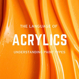
Bold white type says 'acrylics' over a swirl of orange pint photo

Understanding how your paint behaves will transform your gelli printing results — and your painting practice too.

This free guide covers:

Green tick for pros and cons.jpg

The difference between paint types and the Structure - Flow spectrum. 

Green tick for pros and cons.jpg

Choosing the right consistency with intention to support your painting practice

Green tick for pros and cons.jpg

Choosing the Right Paint for the Job

Green tick for pros and cons.jpg

Understanding paint opacity

Green tick for pros and cons.jpg

Printable Studio to Guide Acrylics poster

Newsletter for Artists & Creatives

The Makers Mind in white type over a pink abstarct background

When you download your free guide you'll also receive The Maker's Mind,  my newsletter for artists and creatives who'd love know a little more! 

You can expect:

Green tick for pros and cons.jpg

​Studio process, including honest insights into how I work and what I'm currently exploring 

Green tick for pros and cons.jpg

​Practical printmaking and painting tips and techniques you can try straight away 

Green tick for pros and cons.jpg

New guides and resources (you'll always hear about these first)

Green tick for pros and cons.jpg

Behind the scenes look at works in progress and studio life 

Green tick for pros and cons.jpg

Insights into useful art theory & fascinating snippets of art history

This guide and my newsletter are completely free, just pop in your email and they're yours instantly.

No spam ever, no overwhelm. Just thoughtful letters from the studio when there's something worth sharing.

Unsubscribe anytime.

Charlotte Heart Signature on #Pale Pink.jpg

Already subscribed? The guide will be waiting in your inbox.

bottom of page