Layering Colour: Transparency and Translucency on the Gel Plate

A new investigation into layering colour is emerging in the studio, and it all started with black and white prints.
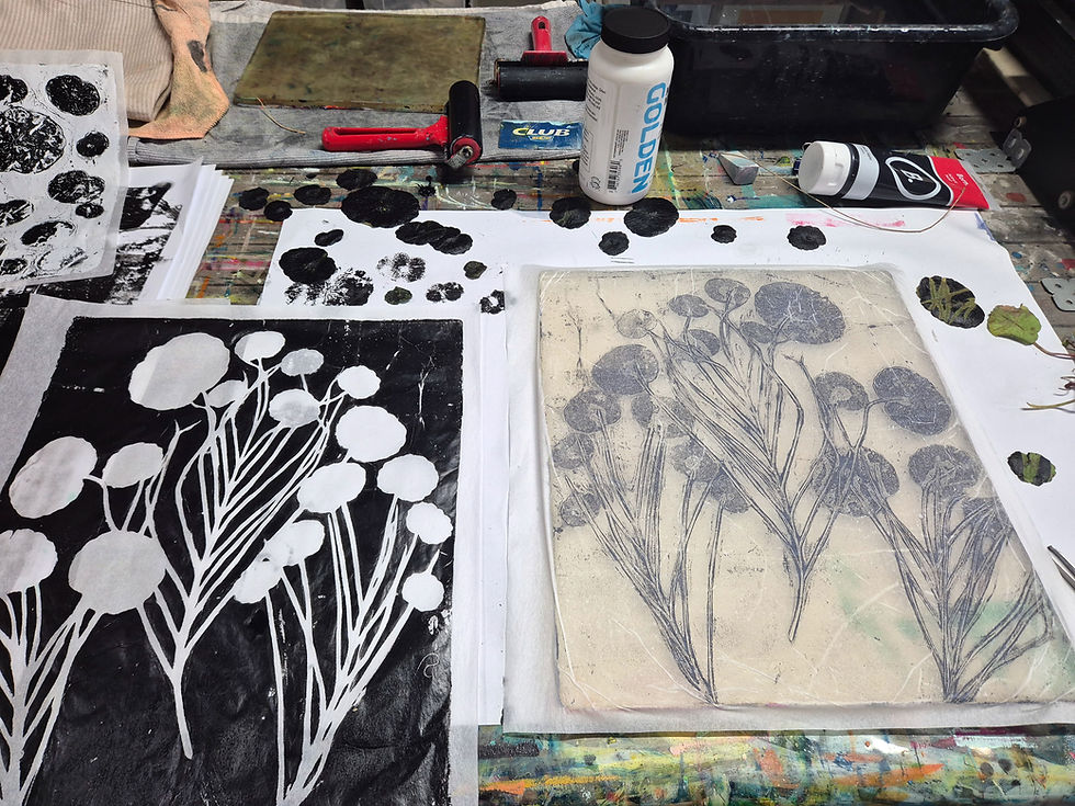
This month I have been working with a new set of black and white leaf gelli prints, with no fixed idea in mind with where they might go or what they might become. They are just impressions taken from the garden around my studio.
The initial organic prints put me in mind of vintage lithograph prints that you might find in a scientific tome. And this got me thinking about how I might layer colour onto the original monotypes in a way that continues to reference my current theme of 'place', without disturbing the original image, or simply painting it.
| Making Many Prints
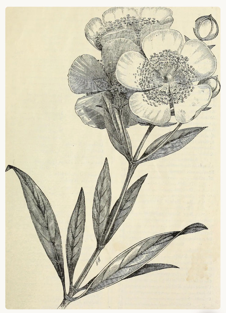
There is something about these prints that carries a feeling of history, attention to detail and the act of 'noticing' which I love. And all these ideas are in keeping with my current areas of exploration.
I will confess I got just a little bit addicted to making them - I ended up with 20 or so!
I thought to begin with, that I was just growing my collage stash but the more I made, the more I began to feel that there might be a different purpose for these ones. So I put the scissors away and let them sit out on the bench for a while, and pondered what to do with them.
| But What About Colour?
I love black and white, but I wanted to bring colour back into these new prints. The challenge was doing it without burying everything I loved about the leaf prints underneath. I did make several prints adding a layer of colour to the background of the leaf print image, but this seemed to flatten the image into a single layer and I wanted to add colour as another step in the process of working with these images rather than it being the final step.

I tried an opaque pale blue background in this print.

For this print I painted the leaf shapes blue and then used an opaque pink for the background.
So I took my time and made a series of small studio studies on paper. Not finished works, just little inquiry experiments on sections of print and in my sketchbook, each one an attempt to answer the same practical question: how do I add another layer of coloured paper over the top of my black and white leaf print and be able to still see what lies beneath; I wanted to use painted paper rather than paint.
| Inspired by the Gel Printers Summit
The starting point was a lesson at the Gel Printers Summit. In Jackie Bernardi's session, on working with transparent and translucent layers of gel prints, she crafted a lovely small landscape piece with a focus on layering gel printed papers for visual interest. What stayed with me was the discussion on using transparent paint colours to create the papers rather than opaque ones.
I use a mixture of both transparent and opaque paints in my gel prints, but usually with more thought given to the colour, rather than where a particular colour sits on the opacity scale. So, it was a new little challenge for me to think more about transparency and opacity before putting paint on the gel plate.
| Transparent, translucent and opaque
Sometimes these words get used interchangeably, but the difference really shows up on the gel plate as they behave quite differently.
The opacity scale will be familiar to you if you're in my Maker's Mind newsletter group, and you can see where the paint colours I used for this experiment, sit on this scale:

Transparent Umber
Quinacridone Nickel Azo Gold
Transparent Yellow Iron Oxide
(plus Quinacridone Magenta)
I had originally collected these colours for glazing areas of my paintings but they worked really well for these explorations.

A transparent layer is like looking through tinted glass. The colour changes, but every line and texture underneath stays crisp. Think of a thin wash of blue over a black mark: the mark is still sharp, just sitting in a blue light.
A translucent layer lets light through but softens what it passes through. It is more like the early morning mist that settles over Lake Weyba. You can still get a sense of the shapes through the mist, but the edges are a little blurred and the level of visual contrast drops.
An opaque layer is not see through at all and simply covers whatever is underneath. Useful in its place, which for me is often in the background of a gel print.
| The Studio Studies
I'm exploring ideas related to 'place' so with a print already made that references my current environment, I decided to cut out a few quick paper stencils using English wildflowers for inspiration - a bluebell and a buttercup. I also chose to make the shapes quite large in scale to contrast with the real life size of the leaves in the black and white monotype.

Quick and easy paper stencils are good for making a few prints and can be used as collage elements once printing with them is finished, as they take on the different layers of paint.

This was an initial print experiment without incorporating the original monotype, just to test colours and shapes and see how the paint layers worked together.
| With or Without a Background Layer?
I made two prints initially, one where I rolled the palest of the transparent colours very thinly across the whole plate to begin with (Transparent Yellow Iron Oxide). I then printed over the top using the stencil shapes and the two other colours (see above).
And another (below) where I used the stencils in the initial print on a blank sheet of wet strength tissue paper which created quite a different feel to the final print, and had better prospects for layering with the monotype, working with these few colours.

I also played around with adding Open Medium to the paint to keep the thin layers of paint wet whilst I pulled the prints. I'll try more experiments using different mediums with different transparencies of paint to see if I can achieve levels of translucency (or maybe even transparency) with some of my favourite opaque paint colours.
I used my cut out paper masks/stencil shapes on the gel plate in such a way that parts of the print received no colour at all. Once I'd collaged the printed design over the original monotype this left areas of the black and white print exposed, creating a striking colour contrast with the new print layer.
| Mini Collages and Sketchbook Pages with Layered Colour
I worked my way through several sketchbook pages using print offcuts to test the translucency of the coloured prints against the black and white and made some small studies on paper to explore shapes and the density of colour in the layers. I also had a go with blues and greens as an alternative colour palette.
| Tips for Working with Transparent Paints on the Gel Plate
Check the paint tube before you start printing. All acrylic paint labels show whether a pigment is transparent, semi-transparent or opaque. Quinacridones, phthalo's and many hansa yellows are naturally transparent. Cadmiums, titanium white and mars black are opaque, and they create solid colour layers when used without mediums.
Use mediums to create super-thin layers of paint. Open Medium (not Retarder Medium) when mixed with the paint will create a really thin paint layer that stays wet for longer, enabling you to pull more than one print from the plate in quick succession.
Go thin with your paint layer. Roll the paint out until it sounds soft and looks velvety rather than ridged and lumpy. If the layer is still heavy, make a quick pull onto scrap paper first and print the thinner second pull as your finished print.
Colour mixes during collage. A transparent yellow over a transparent blue reads as green, but one that's different to green paint straight from the tube. Layering this way is a gentle introduction to optical colour mixing, which I am keen to explore.
Let the papers dry fully before using in collage. This is particularly important if you've added a medium to the paint, as open medium especially can take a while to dry fully.
| Final Thoughts
The studies I liked best still had passages of the original black and white monotype clearly visible. These have become signposts for where to go next with my investigations.
My next steps will include creating new stencil and mask designs and incorporating patterns from my Banksia, Round Leafed Mallee and Mangrove stencils, that I developed for my Threshold Series.
Mediums I'm keen to test with different paints to see if I can achieve translucency and/or transparency:
Glazing Medium
Soft Gel Gloss
Airbrush Medium
And I'll try more experiments with a different range of colours with varying degrees of transparency and see what new hues are created when the collage layers overlap.
Stay tuned!
It's not too late to get involved with the Gel Printers Summit - find out more here and join us today for 14 lessons, from 14 instructors worldwide, which will ignite your imagination!
You can register and receive lifetime access to all the course materials anytime until the end of this years summit on October 11th 2026.