A Palette for the Inner World: The Colour Psychology of Green, Lilac and Yellow - Artwork Spotlight
I love exploring different colour combinations and I'm always looking to see how I can grow my knowledge and understanding of colour and the different energies they create in a painting. But occasionally I find a palette that I keep returning to.

I've found a handful of colours - green, lilac/violet and yellow when used in varying degrees of intensity and saturation work beautifully together and I've come to love this palette. I've made various pieces now using this colour combination across different bodies of work. It wasn't until I lined a few of them up together recently that I noticed how deliberately I keep reaching for this particular group of colours so I thought I'd dig a little deeper into them..
| Fields of Green

Green is considered to be the most restful colour to the eye, which is part of why it often finds it's way into spaces designed for recovery and calm, rooms that feel like quiet nurturing spaces and sanctuaries. Using green in our interior spaces creates a nurturing vibe that evokes the soothing energy we feel when we're out in nature. It's the colour most closely tied to the landscape, and that association is real and genuine; simply being around it is linked to lower stress and a steadier, more settled mood.
But green has many moods. Push it toward yellow, like the lime green running through some of these pieces, and it becomes fresher and more energising, closer to the colour of new leaf growth. Pull it toward blue, so it becomes more teal or turquoise, and it becomes altogether cooler, inviting feelings of contemplation, calmness and serenity.
Did you know? Green carries symbolic weight historically too. In ancient Egypt, green was made from malachite (a vibrant green copper carbonate hydroxide mineral) which was tied directly to Osiris, the god of death and rebirth, and to the seasonal flooding of the Nile that regenerated the land each year. The afterlife itself was imagined as a "Field of Malachite," a green paradise.
| The Purple Place

Lilac and violet invite reflection and imagination. Purple has always occupied an interesting middle ground on the colour wheel, the meeting point of calm blue and energetic red, it has an in-between quality that feels energetically contemplative. Lilac itself, being purple diluted with white, softens all of that into something gentler still.
Push it toward pink and it becomes warmer, evoking a more tender and romantic feeling. When it moves towards true violet it starts to feel deeper and more introspective, and is often found in spaces that encourage inward attention.
It's also a colour with a long association to spirituality and creative thought, which is perhaps why it so often shows up in spaces meant for reflection.
Did you know? Purple and lilac carry their own long history of scarcity and high value. Purple dye was once so difficult to produce (as it was made from sea snails) that it became reserved for royalty across the ancient world, which may be partly why it's still regarded as a colour of superiority and luxury rather than anything ordinary - the dye was literally worth more than its weight in gold. This exclusivity led to purple becoming the ultimate symbol of royalty and power in ancient Rome and Greece.
| Optimistic Yellow

Yellow is a psychologically optimistic colour. It reflects more light back to the eye than almost any other colour, which is one reason why it's the most visible hue in low light and why it's used in eye catching designs. It demands to be noticed before any other colour.
In its brightest, purest form it can sometimes feel very vibrant and overwhelming, but muted and softened as it is in these paintings, the warmth and the optimism are present but with less intensity. Yellow is the colour most closely associated with sunlight itself, and with that comes a kind of radiant, cheerful energy.
Did you know? In ancient times, yellow symbolised the sun and eternity; it was the colour given to the skin of the gods. None of this history is something are necessarily aware of when you encounter yellow in a painting, but perhaps it's there underneath, with the same positive associations quietly weaving their symbolic magic centuries later.
Together, these three colours create a palette that's feels nurturing, enriching and calming, perfect for spaces to settle into, unwind and reconnect with oneself.
The following collection of original artworks are all imbued with the beautiful energies that these colours bring to the palette, but each has its own story.
| A Mind At Rest - Hush
Hush is where this limited colour palette first found its voice, in a piece that felt experimental at the time. Richly layered with collaged prints and paint in teal, lime, violet and yellow, it came to describe a quiet pause, a moment where the world softens and everything feels suspended in a state of peace.
This artwork carries the sensation of a mind at rest, not empty, but held in a nurturing space of reflection and calm. Exploring the muted hues and textures brings a sense of comfort, like the soft closing of a door on the noise of the outside world, inviting you to venture into your inner landscape and simply be.
This painting is part of the Latent Series, a body of work exploring emotional terrain and the landscapes of our inner world.
Mixed Media on Board
60cm x 60cm
Framed in Australian Oak


| An Energetic Journey - Discovery
'Discovery' was one of the earliest pieces in the Latent series with the greens in this palette leaning towards a vibrant energy rather than a restful one. Layered in yellow, teal and soft violet with flashes of pink in the leaves, it speaks to growth and transformation. It's a reminder that true discovery is less about finding answers and more about being open to possibilities.
This artwork captures those precious moments when something long hidden comes into view and changes the way you see the world and yourself. And the awareness of when this happens is part of the journey of 'finding', which was a major element of creating the painting.
This painting is part of the Latent Series, a body of work exploring emotional terrain and the landscapes of our inner world.
Mixed Media on Board
60cm x 60cm
Framed in Australian Oak


| Quiet in the Landscape - Silent Land
The same palette turns up again in the Threshold Series, this time describing a place rather than a state of mind. In Silent Land, it becomes the colour of a landscape that holds you and lets you just be, the particular comfort I find in the quiet, whether at Lake Weyba, in my bushland garden or at the beach. The field barns and eucalypt motifs speak to the past and the present, and the raindrops to the ebb and flow between the two.
This painting is part of the Threshold Series - a body of work exploring the dual landscapes of the Yorkshire Dales and the Sunshine Coast, and what it means to be shaped by both.
Mixed Media on Board
30cm x 30cm
Framed in Australian Oak


Limited Edition prints of Silent Land coming soon.
| An Unfinished Journey - The Winding Way
The Winding Way, is the final painting in the Threshold Series, the palette softens into faded hues that speak to nostalgia. The stone cottage nestled into the landscape is symbolic of the home I carry with me, my roots still visible from the road, and the mangrove motif against the turquoise references Lake Weyba, where those plants were first drawn from life. The path winds across the composition, evoking a life journey unfinished and ongoing.
This is the final painting in the Threshold Series - a body of work exploring the dual landscapes of the Yorkshire Dales and the Sunshine Coast, and what it means to be shaped by both.
Mixed Media on Board
30cm x 30cm
Framed in Australian Oak


Limited Edition prints of The Winding Way coming soon.
| Contemplating Becoming - Drifters
'I'm a soul carried by unseen currents, neither lost nor anchored. I'm simply drifting on the tide of becoming.'
This painting is a contemplation on responding to the ebb and flow of energy that we experience at different times in our lives, and how we gather and release parts of who we are as we strive to meet life with the truest version of ourselves.
This painting is part of the Latent Series, a body of work exploring emotional terrain and the landscapes of our inner world.
Mixed Media on Board
30cm x 30cm
Framed in Australian Oak
| Nostalgic Reflections - The Quiet Road
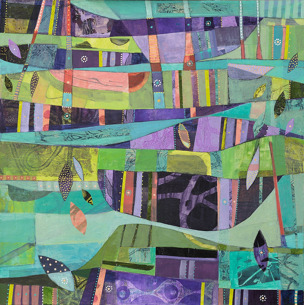
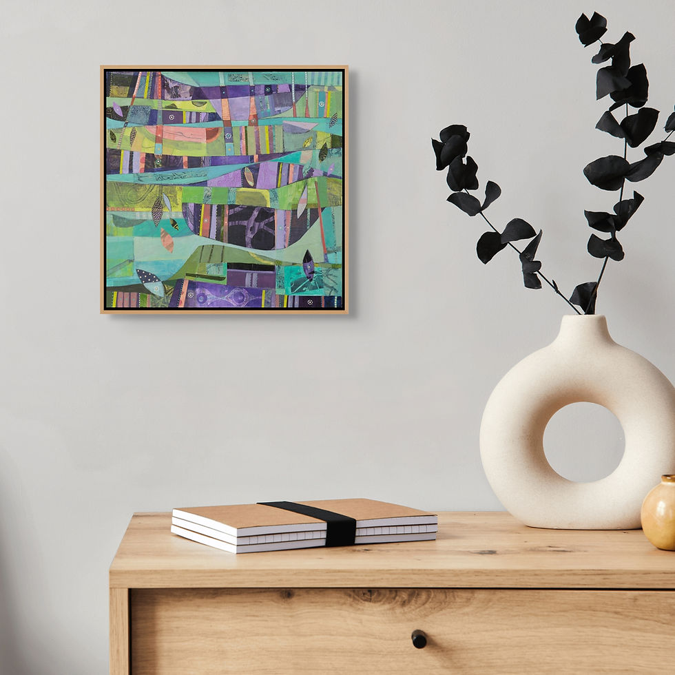
The Quiet Road is a nostalgic reflection on childhood memories of the quiet country lanes of the Yorkshire Dales - small stone cottages and farmhouses huddled behind dry-stone walls, field barns scattered across the view. Looking back, a fluency in place was developing without any conscious awareness of doing so. Roaming through that landscape, noticing everything from sweeping vistas to the tiny lichens colonising stones and tree trunks, and experiencing the environment through all weathers and seasons - all of this was part of the process of place settling subconsciously into the core of my being, becoming in time a defining characteristic of who I am.
This painting is part of the Threshold Series - a body of work exploring the dual landscapes of the Yorkshire Dales and the Sunshine Coast, and what it means to be shaped by both.
Mixed Media on Board
50cm x 50cm
Framed in Australian Oak


Original painting - SOLD
Limited Edition prints of The Quiet Road coming soon.
Six paintings, two series, one palette doing very different jobs each time, sometimes describing an inner state, sometimes an outer landscape, but always the same quiet register underneath. It makes me wonder whether it's less about the subject at all, and more about the particular kind of calm this combination brings into a room, regardless of what it's depicting.
Feel free to reach out if you have any questions about these works or the Limited Edition Prints available or coming soon. I’d love to hear from you and help with any enquiries.
If you'd like to hear about new works and collection releases before anyone else, The Studio Edit is my newsletter for collectors, you can join here.