
4 Colour Harmony Principles to Explore
- Feb 27, 2023
- 5 min read
Updated: Dec 2, 2025
Who doesn't love colour? I'm definitely a 'saturated colour girl' and sometimes I'm tempted to have every colour under the sun on the palette....think 'kid in a candy store'.

But when too many different hues, especially saturated ones, are used together the impact of individual colours can get a bit lost, but with a bit of understanding and a dash of restraint, colours can appear more powerful and in many ways 'more colourful' than if you used too many hues, all at once.
| Colour Harmony Choices
Being intentional with colour choices, gives you the option to decide in advance which hues will be your 'hero' colours, and which colours will form your 'harmonies' and enable you to craft a beautiful palette, where each colour has it's place, supporting rather than detracting from one another.
Spending some time exploring colour options for your painting before you start can help you figure out if your proposed palette will support the mood you want to convey in your artwork, or as I've been doing lately with my sketches, just explore limited colour combinations to see what kind of atmosphere and energy they create.
Though I confess, I'll often start out with colours in mind and change my mind as I go, adjusting and altering hues - it's the artist prerogative after all!
I also find it really useful to go back and revisit work to identify which of the colour harmony relationships I've used in various pieces; often without thinking about it at the time. Reflecting in this way, helps me to see which colour relationships I seem naturally drawn to, which then helps inform future decisions about colour choices for particular pieces.
So to the trusty colour wheel we go!
Let's take a look at four common harmony principles and where to find them on the colour wheel.
| 2 Colour Harmonies
There are two types of 2-colour harmony; Diad and Complementary.
Diad Harmony is a combination of two colours that are separated by one colour on the colour wheel.
In this sketch the colour balance is probably about 90% Red-Orange and 10% Red-Violet. I've used white to create lighter colours (tints) and Payne's Grey to darken some colours to an almost black (shades).


In my Purple Haze Sketch the balance is a bit more even - maybe 33% Red and 33% Violet and 33% neutrals, though I've taken a bit of a liberty with the red and used a more magenta toned colour. For the lighter colours I've tinted with white and for the darker colours I've added Payne's Grey.


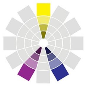
Complementary Harmony is created by pairing the two colours positioned directly across the colour wheel from one another.
Each colour on the wheel has only one complement, which is also called its direct complement.
Complementary colour harmony has the highest degree of colour contrast of all colour combinations and when two complements are placed next to each other, they create visual excitement and enliven each other.
In my Harvest Moon sketch, the colour balance is about 40% Blue, 10% Orange and the remaining 50 % neutrals in whites, shades of grey and blue-black which I've mixed using Payne's Grey, in keeping with the cool blues. The Orange feels like a pop of accent colour in this sketch.


| 3 Colour Harmonies
Split Complementary Harmony is when one colour is paired with the two colours on either side of that colour's direct complement, also known as a divided complement.
Using the split complementary (or divided) harmony is a useful way take the edge off of the strong visual contrast that happens when you use just two complements, which can add more variation and subtlety to your colour palette.
The yellow in this colour study is prismatic (pure) and I've used Red-Violet and Blue-Violet as the split complements.


Triad Harmony is a combination of three hues that are equally spaced from one another around the colour wheel.
For this collage I chose 3 prismatic (pure) colours, Yellow, Blue and Red and created a few variations to these colours by adding white tints and either a touch of Burnt Umber or Payne's Grey to create shades of the basic colours. This harmony principle creates a strong and vibrant feeling that's full of energy.


| 4 Colour Harmonies
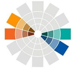
Double Complementary Harmony is a colour combination made up of two sets of complementary colours.
In 'Dream Machine' I used the following combination:
Blue & Orange and Blue-Green & Red-Orange (with a small amount of pink for artistic licence!)


| Analogous Harmony
Analogous Harmony consists of two or more colours that are side-by-side on the colour wheel.
To select an analogous colour scheme, pick any colour on the color wheel. Then, choose two to four more colors directly to the left or right of your colour without skipping over any colours; also called adjoining colours.
For this sketch I used various collage pieces in greens and used Payne's grey as my cool admixture to create darks. The yellow is mostly prismatic whilst the greens vary in shades of Yellow-Green and Blue-Green.


I focused on Red as my starting point for this sketch and chose Red-Orange and Yellow-Orange as the adjoining colours. With these colours being 'warm', I used Burnt Umber as my admixture to create the darks. This piece incorporated both paint and collage pieces which I glazed to get the colours to fall within my chosen spectrum.


If you enjoy working with colour, it's useful to understand some of the basics and with some practice you can begin to make really intentional choices about colour preferences, and as with all things, practice is the key to deepening your understanding.
Fill a sketchbook with lots of colour research experiments - mini collages, colour swatches and notes about what feels and looks good to you (and what doesn't) is a great way to start!
Let me know how you go in the comments below and stay tuned for more Blog posts about colour!
| Join My Art Community
Don't forget to join my Studio Diary mailing list to get my monthly newsletter delivered straight to your inbox and your free PDF copies of my
Top 10 TIPS - COLLAGE BASICS
Top 10 Tips - GELLI BASICS
Top 10 Tips - MEDIUMS and GELS
Follow the link to get your copies today!
#contemporaryabstractart #charlottewensleyart #abstractart #artvideo #artprocessvideo #abstractartprocess #australianart #contemporaryart #modernabstractart #modernart #charlottewensley #artblog #abstractartblog #artblogs #gelliprinting #gelliprint #artmakingvideo #artvideo #artmaking #newabstractart #abstractpaintings #gelliprintcollage #abstractartist #abstractartblog #mixedmediaart #mixedmedia #mixedmediaabstract #abstractmixedmedia #mixedmediaartist #mixedmediavideo #collageart #collage #modernabstracts #sketching #australianartist #artforinteriors #artistsvlog #abstractpainting #colouranddesign #originalabstractart #buyoriginalart #buyabstractart #artinnoosa #queenslandartists #noosaartist #australianartists #australianart #brisbaneartist #brisbaneart #melbourneart #artgalleries #artprints #surfacedesign #productdesign #homedecor #wallart #framedartprints #artprintoncanvas
Sources: Kate Smith LLC (2022); 'Colour' Grange Books (1991) 'Colour Workshop' by David Hornung (2022)


